Short answer: The Cracker Barrel logo changed in August 2025, when the chain swapped its Old Timer, a man leaning on a barrel, for a text-only design, then reversed course about a week later. The lesson for a local business: find what regulars treat as theirs, explain changes first, and change one thing at a time.
What happened to the Cracker Barrel logo
The Cracker Barrel logo changed in August 2025 and changed back about a week later. The new design removed the Old Timer, the illustration of a man leaning against a barrel, and the words Old Country Store. After a loud public reaction, including social media users who called the new design soulless and generic, as CNBC reported, the company said the old logo would stay.
CNBC described the new design as just the words Cracker Barrel against the outline of a yellow barrel, with colors the company said were inspired by its eggs and biscuits, kept close to the original. The man in the old logo is Uncle Herschel, who NBC News reports represents the uncle of the chain's founder. Here's the timeline, from the company's statements as reported by major outlets:
| When | What happened |
|---|---|
| May 2024 | The company announced a strategic transformation to reenergize the brand, according to CNBC's earnings coverage. |
| Aug. 18, 2025 | Cracker Barrel announced its All the More campaign and the logo change, NBC News reported. |
| Aug. 25, 2025 | A statement on the company's website said it could have done a better job sharing who it is, and that Uncle Herschel would stay on the menu, road signs and in the country store, as ABC News reported. |
| Aug. 26, 2025 | The company said: "Our new logo is going away and our 'Old Timer' will remain," as CNBC reported. |
| Sept. 9, 2025 | Cracker Barrel said it was suspending its restaurant remodels, according to NBC News. |
| Sept. 17, 2025 | On an earnings call, the CEO at the time said four locations with the modern design were being switched back to Old Timer signage, CNBC reported. |
We're writing about the logo decision only, as a branding story. If you're planning a change of your own, our rebranding checklist covers the steps in order. This post covers what to learn first.
What Cracker Barrel said it learned from the rebrand backlash
Skip the hot takes about the Cracker Barrel rebrand and look at the company's own words. They're more useful to a small business owner than any expert's guess about what went wrong.
- Keeping the figure elsewhere didn't settle it. On Aug. 25 the company promised Uncle Herschel would stay on menus, road signs and in the store. The next day it reversed the logo itself.
- The explanation came after the reveal. The company's own statement said it could have done a better job sharing who it is and who it will always be.
- Research missed the feeling. On the September 2025 earnings call, Julie Masino, then the CEO, said the company "conducted extensive research," but that "what cannot be captured in data" is how much guests see themselves and their own story in the Cracker Barrel experience, CNBC reported.
- Several things changed at once. The logo arrived alongside a campaign, menu changes and remodeled restaurants, and the company later paused the remodels as well as dropping the logo.
The reaction was also easy to measure. CNBC reported a YouGov poll of 1,000 adults, taken over the weekend before the reversal, which found 65% of Americans were aware of the new logo and 76% preferred the old one. Few small businesses get a national poll, but every one has regulars who tell you what they love, often in their reviews. Our guide to getting more Google reviews is a good way to hear more of them.
The regulars test: four questions before you change a look people love
Most businesses will never face a backlash like the one the Cracker Barrel logo got. But the same thing happens on a smaller scale when a diner repaints its sign, a family plumber drops the founder's name, or a church replaces a logo members drew themselves. Ask four questions first. They're our editorial judgment, built from this story, rather than a published standard.
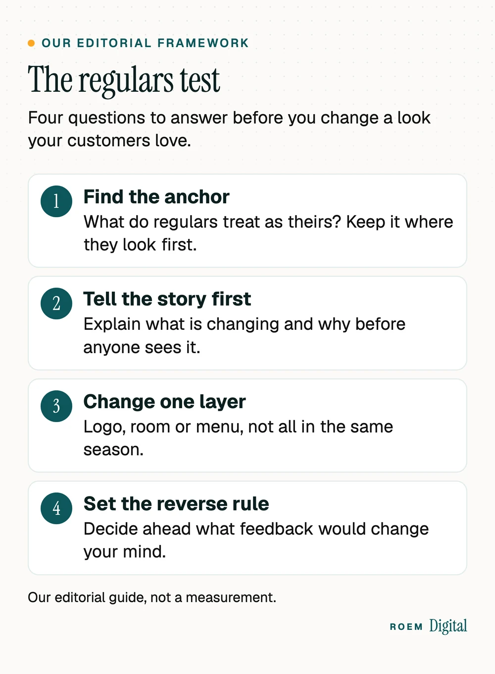
- Find the anchor. Ask a few long-time customers what they'd miss. It's usually one thing: a mascot, a hand-drawn sign, a color, a founder's name. Keep it where people look first, which is usually the sign and the logo.
- Tell the story first. Explain what's changing and why before anyone sees it. Regulars handle change better when they hear the reason from you.
- Change one layer at a time. A new logo, a new room and a new menu in one season gives people three things to dislike at once.
- Set the reverse rule. Before launch, decide what would make you change course, and who decides. Then you're following a plan instead of reacting to the loudest comment.
| Question | What the reporting shows | The small-business version |
|---|---|---|
| Find the anchor | The Old Timer left the logo, though the company said he'd stay on menus and signs | Keep the beloved element on the sign and the logo, not only inside |
| Tell the story first | The company's statement that it could have explained itself better came a week after the reveal | Tell regulars why before the new sign goes up |
| Change one layer | Logo, campaign, menu and remodels were all part of one transformation plan | Space changes out so you can see which one people react to |
| Set the reverse rule | The logo reversal came about a week after the reveal | Agree in advance what would make you switch back |
For most local businesses, the first place a returning customer sees your logo isn't the building. It's the Google Business Profile, on a phone. Our Google Business Profile checklist covers the logo, cover photo and name rules there.
How a local business can update its logo without losing regulars
A small business has one big advantage over a national chain: you can talk to your regulars before anything changes. They're the people most likely to notice a new look, and the most likely to tell you honestly what they think of it. Use that.
- Show the new look to ten regulars first, in person or by email, and listen for what they say is missing.
- Refresh instead of replace when the old logo carries real affection: clean up the drawing, fix the fonts, keep the figure.
- Keep the anchor on the sign and the Google profile. Those are the first places a returning customer sees you.
- Explain the change where people already look: a post on your Google profile, a short note on your website, a sign at the counter.
- Write the new rules down. Our guide to brand guidelines shows what to include so the new look stays consistent.
Changing a name is a bigger job than changing a look, because Google treats some name changes as a new business. Our rebranding checklist covers how that works for your Google Business Profile.
What a refresh can change and still keep the anchor
- Redraw the mascot or figure with cleaner lines so it prints well small, without removing it.
- Keep the colors regulars know and fix only the ones that are hard to read.
- Update the fonts around the logo before you touch the logo itself.
- Make a simpler square version for social profiles and keep the full version on the sign.
If your rebrand gets backlash anyway
Even a careful change can upset people. What you do in the first few days matters more than the design.
- Read before you reply. Sort the reaction into regulars who feel something was taken away, and passers-by who are piling on. The first group is the one to answer.
- Answer once, plainly, where your customers will see it: your Google profile, your social accounts and your website. Say what you heard and what you'll do.
- Reply to reviews calmly and personally. Our guide on how to respond to negative reviews has wording that doesn't make things worse.
- Don't feed the fight. Arguing in the comments keeps the story going. Our post on rage bait covers what to do when someone tries to provoke your business online.
- Use your reverse rule. If the anchor is what people miss, bring it back quickly and say so. Cracker Barrel's reversal came about a week after the reveal.
Give your staff one sentence to say when a customer brings it up at the counter or on the phone, so the answer is the same every time. Reversing isn't failure if it's the right call. Keeping customers matters more than defending a design.
Plan the change, then make the reveal boring
The best rebrand reveal for a local business is a non-event: regulars already know why, the anchor is still there, and the new sign, website and Google profile all change on the same day. That takes planning more than design talent. Order the new sign and print so they arrive close to launch, update the website and social profiles the same morning, and keep the old files in case your reverse rule kicks in.
If you'd like help with that planning, see our brand and web services. We're a small senior team based in Davenport, Florida. We build custom websites, hand-built, not templated, and we set up call, form and booking tracking so you can see whether customers followed you to the new look. You own the domain, the website and every account.
ROEM Digital has no affiliation with Cracker Barrel. This post describes the company's public statements and major news reporting only.
Frequently asked questions
What happened to the Cracker Barrel logo?
In August 2025, Cracker Barrel announced a new text-only logo that removed the Old Timer illustration of a man leaning on a barrel and the words Old Country Store. After a strong public reaction, the company said on Aug. 26, 2025 that the new logo was going away and the Old Timer would remain.
Did Cracker Barrel change its logo back?
Yes. On Aug. 26, 2025, about a week after announcing the new design, the company said its new logo was going away and its Old Timer logo would remain. On a September 2025 earnings call, the CEO at the time said four locations with the modern design were being switched back to Old Timer signage.
Who is the man in the Cracker Barrel logo?
He's known as the Old Timer or Uncle Herschel. NBC News reports that he represents the uncle of Cracker Barrel's founder. The old logo shows him in overalls, leaning against a barrel, and the company said he would stay on its menu, road signs and in its country store.
What did the new Cracker Barrel logo look like?
According to CNBC, the new design kept only the words Cracker Barrel against the outline of a yellow barrel. It dropped the Uncle Herschel illustration and the phrase Old Country Store, while the colors, which the company said were inspired by its eggs and biscuits, stayed close to the original.
What can small businesses learn from the Cracker Barrel rebrand?
Find the element regulars treat as theirs and keep it where they look first, explain changes before revealing them, avoid changing your logo, space and menu in the same season, and decide in advance what feedback would make you reverse course. Then switch your sign, website and Google profile together.
How do you change a logo without upsetting customers?
Show the new design to a handful of regulars first and ask what they'd miss. Refresh rather than replace when the old logo carries real affection. Tell customers why before launch, change everything they see on the same day, and answer early reactions once, plainly, where customers already look.