Short answer: Brand guidelines are a short document that fixes how your business looks and sounds: the exact name, logo versions, colors with their codes, fonts, voice, photo style and where each one appears. For a small business, a few pages is enough if a sign shop, a web designer and a new hire can use it without calling you.
What to include in brand guidelines
Brand guidelines are the written rules for how your business looks and sounds wherever it shows up. They name your logo versions, colors, fonts, voice and photo style, so anyone making something for you gets it right the first time.
You don't need a 40-page brand book. You need the sections below, filled in with real values (color codes, file names, example sentences) instead of adjectives. Some people call the same document a brand style guide or a brand book. The name matters less than whether people can use it.
| Section | What it settles | Small-business minimum |
|---|---|---|
| Name | How the business name is written everywhere | Exact spelling, capitals and punctuation, plus a one-sentence description |
| Logo | Which version goes where | Full logo, a square version, a one-color version, clear space and minimum size |
| Colors | Which colors you use and for what | Each color's name, hex, RGB and print codes, with text pairings that pass contrast |
| Fonts | How headings and body text look | One heading font, one body font, sizes and a fallback |
| Voice | How you sound in writing | A few we-say and we-don't-say pairs, plus the words you use for your services |
| Photos | What real photos of your business look like | What to shoot, what to skip and whether stock photos are allowed |
| Applications | Where it all shows up | Signs, vehicles, shirts, email signature, invoices, Google profile, social profiles |
| Files and owner | Where the master files live | A folder your business owns and the one person who answers questions |
If a new website is on the way, settle these first. Every one of the 12 things a service business website needs leans on them, from the logo in the header to the color of the call button.
The handoff test: write the guide for the people who'll use it
Most brand guidelines templates are written for a corporate marketing department. A local service business doesn't have one. Its brand gets made by a sign shop, an embroidery shop, a freelancer, a relative who's handy with design apps and whoever answers the phone.
So try a simple test. It's our editorial judgment rather than an industry standard: your brand guidelines are done when six people can do their part without calling you. Each one needs different pages.
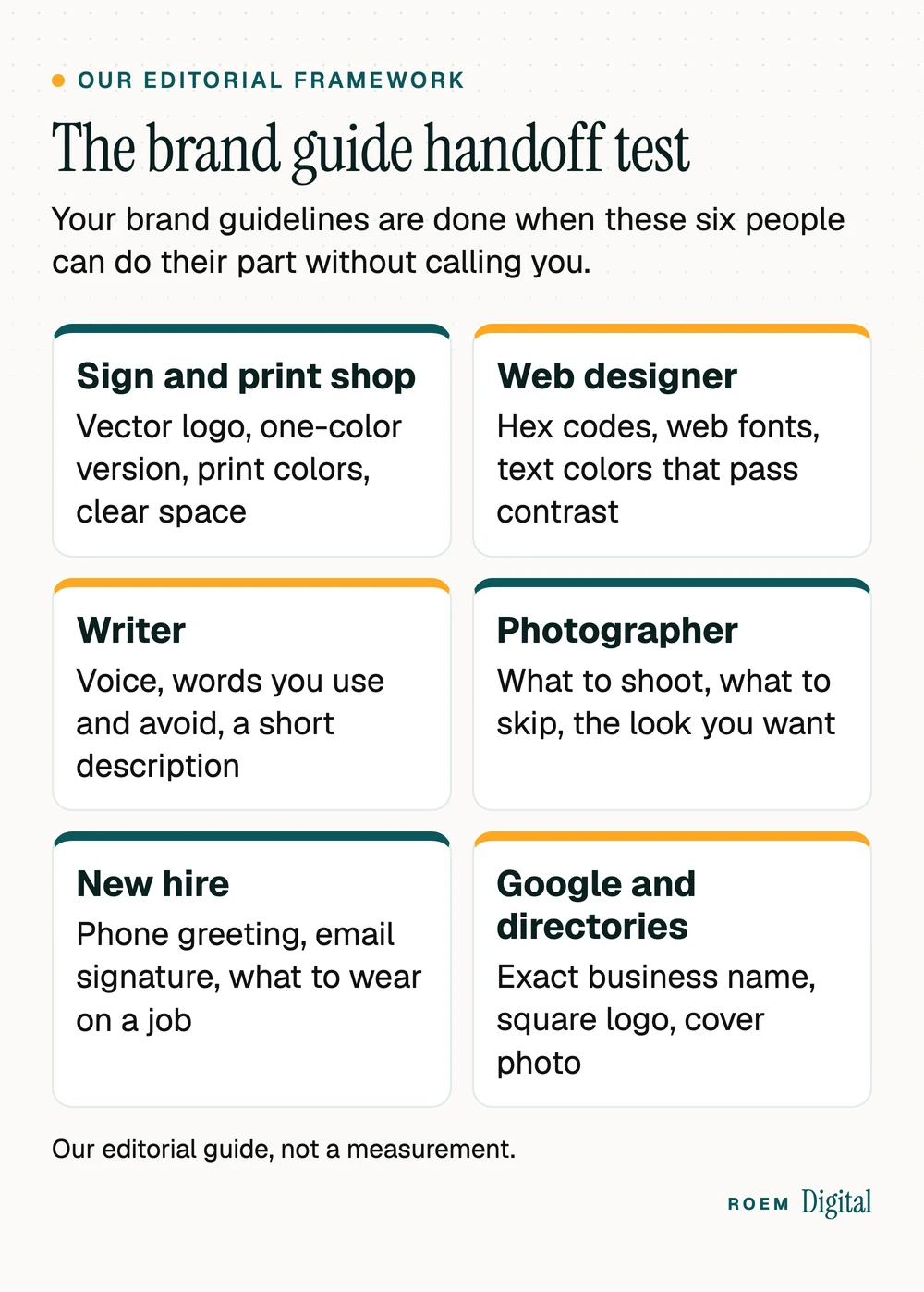
- The sign and print shop: vector logo files, a one-color version, print color codes and the clear space around the logo.
- The web designer: hex codes, web font names, which text colors pass contrast checks and a square icon for the browser tab.
- The writer (or whoever posts for you): your voice, the words you always use and avoid, and a short description of the business.
- The photographer: what to shoot, what to skip and the look you want.
- The new hire: how to answer the phone, the email signature and what to wear on a job.
- Google and the directories: your exact business name, a square logo and a cover photo. Google's Business Profile guidelines ask that your name reflect your real-world name as used consistently on your storefront, website and stationery.
Before you call the guide finished, send it to one real vendor. The questions they ask point to your missing pages. For the rest of what Google needs from you, our Google Business Profile checklist walks through every field.
Logo rules and the file kit every vendor asks for
Big-brand guides spend pages on the logo. Yours needs four answers: which versions exist, how much empty space surrounds them, how small they can go and what nobody may do to them (stretch, recolor, add shadows or outlines).
| File | Who needs it |
|---|---|
| SVG, EPS or PDF (vector) | Sign shops, vehicle wraps, embroidery and your web designer. Vector files scale to any size without blurring. |
| PNG with a transparent background | Documents, slides, social posts and anywhere the logo sits on a photo |
| One-color version | Shirts, hats, stamps, engraving and single-color printing |
| Square version | Social profile pictures and your Google Business Profile logo |
| Small square icon | The browser tab icon on your website |
For the Google profile, Google's photo guidelines say photos look best as JPG or PNG files between 10 KB and 5 MB, with a recommended resolution of 720 by 720 pixels. Save that file in your kit so nobody has to crop the logo on a phone.
Put the trademark symbol rule in writing
Someone will eventually add a symbol to your logo, so decide which one. The USPTO's trademark basics say you can use TM for goods or SM for services even if you haven't filed an application, and that the ® symbol is for registered marks, used only with the goods or services listed in the registration. This is general information, not legal advice.
Changing the logo itself is a bigger decision than writing rules for it. Our rebranding checklist covers the order to do it in, and what Cracker Barrel's 2025 logo change taught small businesses shows what happens when regulars aren't ready for it.
Brand colors: give every color a code and a contrast rule
Write each color down three ways: a hex code for the web (like #1F3A5F), RGB for screens and slides, and CMYK or a Pantone number for print. Then give it a job: main color, accent, background or text. A palette without jobs ends up with every color everywhere.
The rule most brand style guides skip is contrast. WebAIM's contrast checker sums up the WCAG 2.0 level AA standard: a contrast ratio of at least 4.5:1 for normal text and 3:1 for large text, which it defines as 18 point (typically 24px) or larger, or 14 point (typically 18.66px) and bold. WebAIM's article on contrast adds two useful details. Text that's part of a logo has no contrast requirement, and you can't round up, so a common gray, #777777, measures 4.47:1 on white and doesn't pass.
| Color and job | Text on it | Ratio and verdict |
|---|---|---|
| Navy #1F3A5F, main color | White | 11.4:1, passes for any text |
| Gold #C9A227, accent | White | 2.41:1, fails even for large text |
| Gold #C9A227, accent | Navy #1F3A5F | 4.74:1, passes for normal text |
| Orange #E4572E, buttons | White | 3.68:1, large or bold text only |
| Orange #E4572E, buttons | Near-black #111111 | 5.12:1, passes for normal text |

That gold looks lovely on a business card and fails as a button with white text. Writing the passing pairs into your guide stops someone from building that button next year. Our guide to ADA website compliance covers the rest of what makes a site usable for every customer.
Fonts and voice: how the brand looks in type and sounds in writing
Two fonts cover most businesses: one for headings and one for body text. A third, decorative font is fine if it appears rarely. Write down the exact font names, the weights you use and a fallback for places your font isn't available, such as email. Before anyone builds around a font, check that its license covers both web and print.

Voice is the section owners skip and customers notice. Skip adjectives like friendly and professional, since every business claims both. Write pairs instead. A home service company's voice page might read:
| We say | We don't say |
|---|---|
| We'll call you back today. | Your inquiry has been received and will be processed. |
| Free estimate | Complimentary consultation |
| Our crew | Our associates |
| Here's what it costs and why. | Pricing varies based on a number of factors. |
Then list the words you always use for your services (pick cabinet refinishing or cabinet painting, not both), how to write the business name, and a two-sentence description anyone can paste into a directory or a press note. To turn that voice into full pages, see our guide to website copywriting.
Show where the brand appears, not just the rules
Rules are easier to follow next to an example. Add a page of real applications and name the file to use for each one:
- Truck wraps, magnets and yard signs
- Shirts and hats (usually the one-color logo)
- Email signatures, with a fixed logo size and no quotes or extra graphics
- Estimates, invoices and receipts
- Your Google Business Profile logo and cover photo
- Social profile pictures and cover images
- The browser tab icon and the header of your website
Photo rules belong here too. Say what to shoot (your real team, your work in progress and finished, customers only with permission) and what to avoid. Google's photo guidelines for Business Profiles ask for photos that are in focus and well lit, with no significant alterations or excessive use of filters, so a natural look is the safer house style. Our guide on what to post on social media as a local service business shows how those photos turn into posts.
A one-page brand guidelines template you can copy
Start with one page. Copy this outline into a document, fill every line with a real value and save it in the same folder as the logo files.
- Name: exactly how it's written, with and without any legal ending such as LLC, and the versions nobody should use.
- Description: one sentence, plus a two-sentence version for directories.
- Logo: each version with its file name, the clear space (for example, the height of one capital letter on every side), the minimum size and the don'ts.
- Colors: name, job, hex, RGB, CMYK or Pantone, and the text color that passes on each.
- Fonts: heading font, body font, weights, sizes on the website and the fallback.
- Voice: five we-say and we-don't-say pairs and your service words.
- Photos: what to shoot, what to skip and whether stock is allowed.
- Applications: small pictures of the sign, the shirt, the email signature and the Google profile.
- Files and contact: the folder link and the one person who answers questions.
Keep the master files in a folder your business owns, not in a designer's or a former employee's account. It's the same principle as owning your website and ad accounts. Date each version, and update the guide whenever something changes.
When to bring in a designer or a trademark attorney
A template takes you far if you already have a solid logo in vector form. Bring in a designer when you can't find vector files, when the logo turns to mush at small sizes, or when your colors fail contrast and need adjusting rather than a footnote.
Talk to a trademark attorney before you print a new name or logo on anything expensive, and before anyone adds the ® symbol. This article is general marketing information, not legal advice.
Brand identity is part of our brand and web work. We're a small senior team based in Davenport, Florida, and the websites we build on top of a brand are hand-built, not templated. Your domain, website and brand files belong to your business.
“I can’t say enough great things about ROEM Digital! They did an amazing job bringing my vision to life with our beautiful website and continue to do a great job with our marketing and ads. They really take the time to understand my brand and what I’m trying to accomplish. They’re creative, professional, responsive, and genuinely care about helping my business grow. As a business owner, having a team I can trust means so much. I’m truly grateful for their work and highly recommend them!”
Frequently asked questions
What should be included in brand guidelines?
At minimum: the exact business name, logo versions with clear space and minimum size, colors with hex, RGB and print codes, heading and body fonts, a short voice section with words you use and avoid, photo rules, examples of where the brand appears, and where the master files live.
How long should brand guidelines be for a small business?
One page is a fine start, and a few pages is plenty for most local businesses. Length matters less than usefulness. If a sign shop, a web designer and a new employee can each do their job from it without calling you, the guide is long enough.
What is the difference between brand guidelines and a brand style guide?
Usually nothing. Brand guidelines, brand style guide, brand book and brand standards all describe the same document. Some larger companies keep a separate editorial style guide for grammar and writing rules, but a small business can keep everything in one file.
Is there a free brand guidelines template I can use?
Yes. Copy the nine-line outline in this article into any document: name, description, logo, colors, fonts, voice, photos, applications, and files and contact. Fill each line with real values such as codes and file names rather than adjectives, and save it next to your logo files.
What logo file formats does a small business need?
Keep a vector file (SVG, EPS or PDF) for signs, wraps and embroidery, a PNG with a transparent background for documents and posts, a one-color version, a square version for social and Google profiles, and a small square icon for your website's browser tab.
Do brand colors need to meet contrast rules?
Text does. WCAG level AA asks for at least 4.5:1 contrast for normal text and 3:1 for large text. Text that's part of a logo is exempt. Check each text and background pair in a free contrast checker and write the passing pairs into your guide.
Should I put TM or the R symbol on my logo?
According to the USPTO, you can use TM for goods or SM for services without filing an application, while the registered symbol is only for federally registered marks and the goods or services they cover. For anything beyond that, ask a trademark attorney. This is general information, not legal advice.